
[Scroll]
2024
Multidisciplinary
Visual Artist.
Graphic Designer - Editor - Visual Effects Artist.
View on a desktop ONLY. Mobile view still under work.
A Year of Growth
We've reached new heights together, redefining success in the creative industry. Let's celebrate our shared journey of growth, innovation, and impact.
Graphic Design
Posters, Flyers, Photo Retouching
Visual Effects & Editing
Film Editing, Colour Grading, VFX, Motion Graphics
Manga & Comics
Storyboarding, Panel Layouts, Character Design, Visual Narration
Clothing & Merchandise
Apparel Design, Product Mockups, Streetwear Branding
Music Industry Design
Cover Art, Promotional Posters, Social Media Visuals
Corporate Branding
Logos, Product Etching, Packaging Business Cards, Corporate Identity
I am Sanele Makhanya, a creative born and raised in Durban, South Africa, now carving my path as a designer, editor, and storyteller in Johannesburg. My journey started long before I had the tools. I was always fascinated by how stories were told visually, how a single image or cut could shape the way people feel. That curiosity led me to study film, where I earned a Bachelor’s Degree in Motion Picture Medium, majoring in editing and visual effects.
What drives me is not just the work itself but the reason behind it. I create to connect. To me, design and film are not just careers, they are ways of translating emotions, experiences, and perspectives into something that lasts. Whether I am working on a brand identity, building a manga panel, or piecing together a film edit, I am searching for that spark, the moment when a vision comes alive and resonates with someone else.
My motto “Never rest, never stop” is more than a line. It reflects my belief that growth never ends, that creativity is a constant pursuit, and that resilience shapes everything I do. I thrive on challenges, I push myself past comfort, and I carry that persistence into every project I take on.
About me
I am Sanele Makhanya, a creative born and raised in Durban, South Africa, now carving my path as a designer, editor, and storyteller in Johannesburg. My journey started long before I had the tools. I was always fascinated by how stories were told visually, how a single image or cut could shape the way people feel. That curiosity led me to study film, where I earned a Bachelor’s Degree in Motion Picture Medium, majoring in editing and visual effects.
What drives me is not just the work itself but the reason behind it. I create to connect. To me, design and film are not just careers, they are ways of translating emotions, experiences, and perspectives into something that lasts. Whether I am working on a brand identity, building a manga panel, or piecing together a film edit, I am searching for that spark, the moment when a vision comes alive and resonates with someone else.
My motto “Never rest, never stop” is more than a line. It reflects my belief that growth never ends, that creativity is a constant pursuit, and that resilience shapes everything I do. I thrive on challenges, I push myself past comfort, and I carry that persistence into every project I take on.
Before we dive into the work, I think it’s important to share a bit about myself and the journey that’s shaped me as a creative. My background, experiences, and perspective all play a role in how I approach each project, and this section gives some context before you explore the work itself.
Significant Milestones
Comic Book Release
Launched The Mad King Zooloo (The King's Betrayal) to great reception, praised for its storytelling and detailed artwork.
VFX
Achievement
Created high-level projects like a fully simulated house fire, showcasing advanced compositing skills.
Social Media Growth
Built steady momentum online with strong engagement on design and VFX content.
Poster Design Recognition
Event and music posters received strong feedback, boosting my client network and visibility.
Higher-Caliber Projects
Shifted into larger, more polished works including merchandise design, video edits, and AI-driven visuals.
Brand Collabs
Partnered with Devoted Media Studios, Tradden, and Opus Coffee to elevate brand identity.
Corporate Design
This section features branding and design work created for various businesses and organizations I have collaborated with. It includes complete brand identities, logo designs, stationery, mock-ups, brochures, pamphlets, and billboards developed to strengthen each brand’s visual presence. These projects reflect my ability to design with professionalism and consistency, helping companies build recognizable and cohesive identities that support their growth and communication goals.

Devoted Media Studios is a creative web design and photography studio based in Auckland Park, Johannesburg. They specialize in crafting powerful visuals and digital solutions that help brands stand out.
From professional photography and graphic design to custom WordPress websites, their team works closely with you to bring your vision to life. Whether you’re launching a new brand, enhancing your online presence, or creating content for marketing, Devoted Studios is your creative partner for standout results across all platforms.
Since June 2025, I have been working at Devoted Media Studios as one of two graphic designers, focusing on shaping the overall branding and visual identity of the business. My role has included designing social media graphics, marketing materials, A.I intergrated mockups and advertisements that align with the studio’s mission of delivering standout creative solutions.
Working within a small team, I have contributed to refining the studio’s presence across platforms, ensuring a consistent and engaging brand image that supports their work in web design, photography, and digital media.


.png)
Tradden (TRADDEN) is a digital B2B trade platform designed to boost intra-African commerce by connecting verified buyers and sellers of bulk commodities, goods, and services. With features like smart contracts, escrow-backed payments, and integrated logistics, the platform makes cross-border trade more accessible, particularly for SMEs and township businesses.
As part of my role, I created social media graphics and handled print design, working on billboards and pamphlets that promoted Tradden’s mission and offerings. This allowed me to translate the platform’s innovative vision into strong visual communication, ensuring its message reached both digital and physical audiences effectively.


Cori Creative Studios is a branding and design agency focused on creating strong and cohesive visual identities for businesses and individuals. The studio works across brand identity, graphic design, video production, and digital marketing assets to help clients build a distinctive presence.
I contributed by designing the logo, along with digital and print assets such as a full stationery set with business cards, notebooks, USBs, envelopes, shopping bags, and letterheads. Each piece was carefully developed with attention to color, typography, and layout, ensuring consistency across all mediums.
This project demonstrated how design can translate a brand’s identity into practical touchpoints that build professionalism and credibility.

Opus Coffee is a brand designed to position coffee as more than a beverage, but as an art form that blends craftsmanship with creativity.
Inspired by the word “Opus,” meaning a great artistic work, the brand identity draws on the idea of each cup being a harmonious composition of flavors, textures, and aromas, much like a musical symphony. The goal was to establish a refined and immersive coffee brand that feels both sophisticated and approachable.
My role involved creating the logo design, typography system, packaging, and marketing collateral. The logo was developed with bold yet clean forms that conveyed both strength and elegance, paired with typography choices that balanced modernity and artistic flair.
I applied the identity across various touchpoints, including coffee bags, takeaway cups, loyalty cards, and promotional graphics, ensuring consistency in color, type, and iconography.
This project highlighted how a brand’s concept can be translated into both visual identity and consumer experience, showing how design choices directly shape the perception of quality, creativity, and culture.
Nibb is a contemporary cookie brand created for the modern snacker. It embodies simplicity, indulgence, and convenience while staying playful and memorable. The brand is based on the joy of nibbling, offering a portion-friendly treat that feels as satisfying as a full-sized cookie but in a format that allows for more flavors, variety, and experiences.
I worked on the logo design, packaging, and brand applications, ensuring the identity reflected Nibb’s playful yet premium character. The packaging system was bold, minimal, and instantly recognizable, with bright colors and fun visuals that aligned with the concept of bite-sized indulgence. Beyond packaging, I also extended the identity into items like business cards, aprons, and cookie bags, maintaining consistency across all brand touchpoints.
This project showed how branding can balance playfulness and sophistication, creating a snack identity that is both eye-catching on shelves and memorable to consumers.
Nibb – Choco Bites is a playful twist on classic chocolate snacks, created to blend indulgence with convenience. These bite-sized cookies combine a crisp cookie crunch with rich, velvety chocolate, designed for on-the-go snacking, social sharing, and indulgent moments. The goal was to capture the joy of snacking through a fun and instantly recognizable sub-brand under Nibb.
I developed the packaging design, product visuals, and social media content, focusing on a cohesive identity that felt bold, inviting, and easy to market. The campaign emphasized visual appeal and engagement across platforms, showcasing Choco Bites as a modern, portable treat for any lifestyle.
Each element, from the logo and color palette to the promotional visuals, was designed to reflect the brand’s message of “Small Bites, Big Delights,” creating a consistent and appetizing presence both online and on shelves.
.png)


When I created the brand identity for EverGlow Pure Solutions, my goal was to build a clean, sophisticated, and science-backed skincare brand that feels natural, empowering, and genuinely focused on healthy skin. I designed the logo using a soft, floral-inspired symbol paired with an elegant serif logotype to communicate purity, balance, and a gentle, premium touch.
From there, I developed a warm and modern color palette that combines soft skin-tone neutrals with deeper, more refined shades to represent both natural beauty and scientific credibility. I also created a signature repeating pattern using elements of the logo, giving the brand a unique visual texture that works beautifully across packaging, marketing materials, and merchandise.
The photography direction centers around real, glowing skin and soft, clean lighting to reflect the brand’s focus on authenticity and natural radiance. For the packaging, I kept the designs minimal, warm, and modern, using clear hierarchy and generous white space to reinforce a premium yet approachable feel.
To balance elegance with modern clarity, I chose a combination of serif and sans serif typography, allowing the brand to communicate both trust and simplicity. Throughout the process, I stayed focused on developing a cohesive narrative—positioning EverGlow Pure Solutions as a brand that blends nature and science to empower people to feel confident in their skin at every stage of life.
.png)

Event Poster Design
This section highlights a collection of experimental posters and visual pieces created both for personal expression and collaborative projects.
Many of these designs were developed as part of my own creative exploration, while others were produced as marketing materials for artists and brands seeking unique visuals for their rollouts. Each piece reflects a blend of conceptual thinking and bold aesthetic choices, many of which gained strong engagement across social media, reinforcing their impact and relevance within visual culture.
A commemorative poster inspired by After Hours, created entirely in Photoshop.
This design was a personal homage to the album’s cinematic aesthetic and received an overwhelming response on socials, further solidifying my poster work as a standout creative medium.

The Weeknd — After Hours Tribute
A poster inspired by Donda, designed in Photoshop with striking tones of pink and black.
The rich color palette gave the piece a unique look that instantly grabbed attention, earning standout feedback across socials for its bold and unexpected aesthetic.

Kanye West
Donda Reimagined

Uncle Waffles — Cinematic Fusion Poster
This experimental poster reimagines Nelson Mandela in a modern-day photoshoot setting, giving him a bold, contemporary vibe.
Using MidJourney to create the base image and Photoshop to refine the details, I highlighted elements like his grills and chain against a dark aesthetic.
The piece received unexpectedly strong online engagement, mainly for its unique style and striking visual impact.

Mandela Reimagined — Contemporary Portrait
This poster re-imagines award winning South African Amapiano artist Samthing Soweto's Isiphithiphithi album using AI and Photoshop, creating a fresh, elevated take on the original.
The design performed exceptionally well online, especially on TikTok, where it garnered over 46,000 views and thousands of comments, showing strong engagement and widespread appreciation.

Samthing Soweto — Reimagined Album Poster
This poster features a ferocious barking dog with iced-out grills and a red butterfly passing by its mouth, continuing the Silqe Injayam series conceptually. Designed with AI and Photoshop, it was well-received by Sliqe and his large audience, generating strong engagement online.

Injayam Vol. 4 — DJ Sliqe Concept Poster
.jpg)
Uncle Waffles — Tokyo Drift Aesthetic
I created a bold poster that blends Uncle Waffles’ vibrant persona with the high-octane energy of Fast & Furious: Tokyo Drift.
This particular variation was designed entirely in Photoshop, while other versions started with AI prompts in MidJourney, were retouched in Photoshop, and then had faces matched using a face swapper bot on Discord.
I also enhanced the animated version with Higgs Field AI and After Effects, which received strong online attention.
The motion version is available on my Instagram, and you can find it through the social links in the footer.
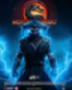
Nasty C — Mortal Kombat Concept
I created a mashup imagining Nasty C as Raiden from Mortal Kombat, blending gaming culture with his music identity.
This piece was made using the same process as my other works: starting with AI prompts in MidJourney, refining the design in Photoshop, and then using a face swapper bot on Discord to match facial details.
The animated version was further enhanced with Higgs Field AI and After Effects, which helped it gain strong engagement online.

AKA — Tribute Poster
This piece was created as both a farewell and a celebration of AKA’s influence. Designed in Photoshop, the poster blends bold composition with a somber atmosphere, using color and light to capture the duality of loss and legacy.
It wasn’t just a design, it became a space where fans could reflect, connect, and honor his memory. The strong response online showed how deeply his presence still resonates, and how visual art can carry emotion beyond words.

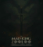
John Wick — The Last Chapter Poster
Inspired by John Wick: Chapter 4, this poster is my own take on the film’s world, blending dreamy visuals with rich red tones to capture its intensity. Created in Photoshop, it emphasizes cinematic mood and style, and the design was well-received online for its striking, immersive look.

Zoocci Coke Dope — Zooloo's Revenge
This poster imagines award winning South African Hip-Hop producer Zoocci Coke Dope in a Game of Thrones scenario, holding a two blades whilst fighting his adversaries.
Created with MidJourney and refined in Photoshop, it complements the the theme I was trying to portray which is perseverance.

Travis Scott — South Africa Tour Poster
This poster celebrates Travis Scott’s upcoming South Africa tour, designed to capture the excitement of his arrival. Created with Photoshop, it resonated strongly online, gaining significant recognition and high engagement across social media.
This poster blends Uncle Waffles with the world of Fast and Furious: Tokyo Drift, combining MidJourney-generated imagery and Photoshop refinement for an elevated look.
Inspired by Inception’s cinematic tones, the animated version created with HigsField AI adds dynamic movement, and the piece received strong engagement online.

These poster designs have significantly amplified my presence and recognition across social media platforms. On TikTok, they collectively garnered over 19,000 likes and countless views, bringing substantial visibility even with inconsistent posting. Instagram growth has also been strong, with these projects helping me reach over 12,500 followers, demonstrating the resonance of my design, editing, and visual effects work with audiences.
Pinterest has shown consistent engagement as well, with monthly views averaging 10,000–15,000, reflecting sustained interest in my content.
From 2024 to 2025, these projects have been pivotal in expanding my reach and establishing a healthy, engaged following. Beyond the numbers, the designs sparked meaningful interaction, discussion, and recognition, showing how impactful creative visual storytelling can be across multiple platforms.


Analytics from the poster
designs
You dared to dream bigger, and together we turned those dreams into reality. Our collaboration made us unstoppable.
So much more is coming in 2026
[Q1/2026]
Focus on poster design, develop comic book concepts, and plan music video projects.
[Q2/2026]
Release new comic content, shoot and direct music videos, and produce short reels.
[Q3/2026]
Expand poster series, continue music video production, and explore experimental visuals.
[Q4/2026]
Release completed music videos, wrap up comic projects, and showcase overall portfolio growth.
Looking Ahead:
Key Trends Shaping 2026
[1]
Conscious Impact
I will focus on creating work that carries meaningful messages and resonates deeply with audiences, emphasizing social awareness and cultural relevance.
[2]
Adaptive Resilience
My projects will reflect flexibility and innovation, adapting to evolving creative tools, platforms, and audience expectations while maintaining high-quality output.
[3]
Seamless Digital Integration
I will continue blending design, visual effects, and interactive media across platforms, creating cohesive experiences that bridge physical and digital spaces.
[4]
Wellness-Centered Approach
Prioritizing personal balance and mindful creativity, I will ensure that my workflow supports both sustainable productivity and thoughtful, intentional artistry.
Diving into
Visual Effects & Editing
This reel is a showcase of my film background, bringing together the editing and visual effects work I completed throughout 2024. As someone trained in the Motion Picture Medium with a focus on editing and VFX, I used this reel to demonstrate the technical and creative range of my craft.
The projects combine Premiere Pro for editing narrative content, After Effects for advanced VFX, and Blender for 3D integration. Within After Effects, I explored techniques such as rotoscoping, masking, compositing, and motion graphics to elevate scenes and bring cinematic polish to short films and experimental projects. Blender allowed me to merge 3D assets into live-action footage, pushing the realism and depth of certain sequences.
This reel isn’t just a compilation, it’s a narrative journey that reflects how I approach storytelling through visual effects and editing. Each piece highlights my ability to merge technical precision with creative intent, and together they represent the foundation I’ve built in film while pointing toward bigger, more ambitious projects in 2026.
This project is a visual breakdown of a scene I created in After Effects, where a house slowly burns as the camera tracks through its rooms. The sequence ends with the reveal of an individual holding a lighter, hinting at the cause of the fire.
The breakdown showcases the process step by step, using before-and-after slides to highlight how fire, smoke, and lighting assets were composited into each shot. Techniques such as masking, blending modes, and atmospheric layering were applied to achieve realism while keeping the camera movement immersive. By combining the full video with still slides and text overlays, the project demonstrates not only the technical workflow but also how VFX can be used to build tension and narrative meaning truly cementing it as one of the hardest projects I have been a part of to date due to implementation.
Released in 2024, Through the Pane is my graduation film where I led editing, VFX, creative direction, and shot listing. The story follows a successful writer battling creative block, whose life unravels when confronted by a rival from her past. The project pushed me creatively and financially, and its international recognition marked a major milestone in my filmmaking journey.
The trailer for Through the Pane, crafted entirely by me through editing, sound design, and VFX, captures the film’s psychological tension and dramatic core. Released in 2024, it set the stage for the film’s recognition and showcased my ability to merge technical precision with cinematic storytelling.
Reel Editing
This section features a range of short-form video content I have created for clients and personal projects. The Reels include creative process videos, event highlights, and promotional content designed to engage viewers and showcase each brand’s identity.
For clients, my focus is on visual storytelling through concise and appealing edits that highlight what makes their business stand out. This includes shooting and editing content for restaurants, lifestyle brands, and events, capturing the atmosphere, people, and experiences. My personal Reels focus on behind-the-scenes process clips that document how I develop design and creative projects from concept to completion.
Manga and Comics

Chapter 1 - The King's Betrayal
Earlier this year, I released my comic book project, introduced first through its cover.
The story follows a medieval-inspired world filled with conflict, loss, and vengeance, told through the lens of characters whose struggles mirror larger themes of grief, power, and survival.
Synopsis: He was a king carved from war... A blade raised by blood, and a ghost born from betrayal. When his nation burned, he vanished. Not into death but into silence.
They called it treason. Now, his brother sits the throne. The fires rage again. And somewhere beyond the ashes, the mad king lives.
The visual style takes inspiration from the gritty realism of Vinland Saga and the dark intensity of Berserk.
I chose this approach because it emphasizes detail, weight, and emotion in every frame, something digital shortcuts often fail to achieve.
This style reflects the time and precision invested into each panel, making it visually immersive and unique to the story’s atmosphere.

Art Style & Influence

Storyboarding & Pre-Production
The creation process felt closer to film production than simple comic-making.
I started with storyboarding, mapping out the narration, character arcs, and backstories to give the story both depth and structure.
This stage was important for grounding the narrative while keeping consistent with the medieval tone and the thematic inspirations guiding the project.
Pre-production also involved sketching each character in detail, with attention to their attire. Because the world is medieval-inspired, the costumes needed to feel authentic without being overdesigned.
Each sketch became an exercise in balancing believability with individuality, giving every character a unique presence while staying true to the world I was building.
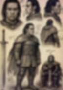
Character Sketching & Design
Marketing & Release
The marketing strategy was carefully planned.
Instead of releasing the comic outright, I teased it with cinematic-style posters and visuals that carried a Game of Thrones type of feeling, paired with “coming soon” tags to build anticipation.
This helped create excitement before the official release, and once announced, the project gained strong audience reception. The rollout became part of the storytelling itself and added to the impact of the launch.
The comic book performed exceptionally well, exceeding my expectations and receiving amazing support from the audience.
To show my appreciation, I ran a giveaway, sending physical copies to seven lucky fans. Two of these packages also included exclusive posters as a special thank-you for their love and engagement.

Giveaways
Comic book analytics


During the marketing phase leading up to the release, the comic generated strong traction on Instagram with over 20,000 views in total and a reach of 7,266 accounts before the book was even posted. After launch, a promotional poster brought in 8,300 additional views, while story posts accumulated a combined total of 14,400+ views. Altogether, the campaign drew in more than 42,700 impressions across Instagram.
Beyond social media, the release itself gained momentum on comic book reding platform GlobalComix, where the book reached 10,000 views in the first month.
These numbers highlighted not just growing engagement, but also clear audience patterns. The majority of the reach came from South Africa’s major cities, with Cape Town leading, followed by Johannesburg, Durban, and Pretoria. This confirmed the comic’s ability to resonate strongly within urban creative hubs and positioned it well for ongoing visibility and growth.
Clothing & Merchandise
Most of my T-shirt designs come through social media, where clients DM me concepts often inspired by music and bold, abstract ideas. I start by gathering their references, then create multiple revisions, blending their vision with my own artistic input to make each design unique.
I sketch and develop concepts in Procreate, then refine and build mockups in Photoshop, ensuring the final T-shirt reflects the client’s direction while standing out creatively.
I’ve also designed T-shirts for Casual Day, a store specializing in customized apparel, which strengthened my ability to balance client requests with visually striking execution.


Music Industry
Design
This section showcases design work created for artists and music-related projects. Most of the work includes single and album covers, along with promotional posters and short-form Reels produced to support releases and rollouts. The majority of my collaborations in this space focus on creating visually engaging covers and social content that connect with audiences and amplify the artist’s identity across digital platforms.

.jpg)
School of Snakes is a collaborative EP between producer Soulkit and artist Votron of the Cloud Internet Boys collective. I designed the cover art and tracklist in Photoshop, with full creative freedom that allowed me to align with their vision. The project gained strong audience reception and social media feedback, making it one of my better-performing music cover designs.


For Bangerville 2, the artist wanted a design inspired by the Bad Boyz franchise, mixing cinematic action themes with gritty graphics. After refining the concept, we landed on this final cover, which Sliqe, the executive producer, loved for capturing the project’s vision.
This project is set to release on the 24th of October 2025.


KROSA is a single by Votron and Blxckie, one of South Africa’s most influential hip-hop artists today. Their collaboration built on years of working together within the Clout Internet Boys collective, making the track an important cultural moment.
I designed the single’s cover, working from Votron’s references that centered on a green, UFO-inspired concept. The final artwork reimagined both artists floating upward into a saucer, blending surreal sci-fi imagery with their collaborative energy.
The release gained strong attention thanks to Blxckie’s presence and the striking, futuristic design.

I contributed by designing all the social media graphics and editing some of the short-form reel content, including the one featured in my content.

The MXR is a hip hop showcase created by producer Sliqe, where he and a guest DJ perform exclusive sets shared on social media and in full on YouTube. The events have become a cultural touchpoint in the local hip hop scene, giving audiences access to fresh, exclusive music.
My role was in shaping the visual identity of the events through social media graphics and select reel edits, helping define how the showcase is experienced online and strengthening its cultural presence.
For Sliqe’s MXR series, I created a reel for the very first event, which introduced the concept to the broader public.
While the event itself was exclusive and focused on artists vibing to unreleased music mixed live by Sliqe, the reel captured its atmosphere and energy for social platforms.
The full versions of these sets are posted on YouTube, with the latest MXR release accumulating over 100K views in the first two weeks, reflecting both the cultural weight of the series and the visual influence I have contributed through my work.